2016 US Presidential Election results by county. (University of Michigan)
Diversity theater
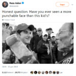
If you want to understand what it means to live in a bubble, consider this episode: a few days ago Vice President Elect Mike Pence fancied to spend a little time relaxing with his family and they went to a theater; to a musical about the life of Alexander Hamilton, no less.
He got booed by people in the audience, then after the show the entire cast proceeded to scold him, with a sort of partisan official statement, under the guise of asking for an adequate protection for every citizen (and the planet!) in the name of diversity.
In other words, you are racists, enemies of all that is good, by definition. We, the Thespian Class, resent your unacceptable victory, and proceed to attack you to your face, because we occupy the Moral High Ground. Our ability to entertain means we are oh-so-clever, and gives us a superior understanding and a say in all matters; whatever we take for granted defines reality; by consequence you are already guilty of anything you are accused of, and your best chance is that of heeding to our requests and come to terms with us, recognizing our leadership and influence.
I’d have responded to their attack like this:
I understand that you think you have good reasons to vent anger, channeling your prejudices, while deluding yourself into thinking you are the least prejudiced people ever.
Today’s America is divided, in a way, between two camps: take a look at a map of the vote by county. In the smaller blue areas, the Democrat urbanites prevail; in Flyover Country, deep seas of red mark the Republican rural territory.
This kind of divide is nothing new or specific of the USA: on the contrary, it’s been a typical feature of history.
The first Christians for instance were the coolest guys in town, in a sense: the initial spread of the Gospel was mostly through preaching in the biggest town centers. As a consequence, they began identifying the followers of the traditional Roman religion as “pagans”, a word that actually meant peasants: people from the countryside, that thanks to some degree of isolation typically stayed put with their traditions far longer than their counterparts living mostly in coastal cities.
I know, I know: you are now thinking of rednecks dragging their feet and preventing America from evolving, because they tend to cling to their guns and Bibles, to paraphrase Obama.
But change isn’t always a positive thing. Tradition and prudence are necessary for a civilization to thrive.
In the rural world you learn to rely on yourself; in the urban jungle you depend on others.
The cities are not necessarily the bee’s knees. Until modern times urban centers were population sinks: they could sustain themselves only through immigration, because the mortality rate there was really high. The reasons include starting wars, turmoils and pogroms.
Yes, almost everything that is new and good originally came from cities; but that’s also true of the worst and newest forms of evil.
The Christian Civilization spread through the kind of cultural exchange that is possible only in densely populated areas; so did the abolitionist movement and advancements in technology. But Communism and Nazism did too!
Instead of focusing on vague concepts like “change” and “diversity”, you must ask yourself what is right and what is wrong. To focus on positive change, and to oppose what is harmful.
Otherwise, your living in a big urban conglomerate where a lot of interesting stuff happens every day, will only serve as an opportunity to become a blind follower of the latest trend, feeling part of a close-knit tribe, reinforcing your prejudices through peer validation. And you’ll be unable to understand if you are following the lead of a new Martin Luther King or maybe instead the next Maximilien de Robespierre.
Here’s a useful rule-of-thumb approach to the Future: are we facing a period of prosperity and growth, or a period of decadence? If the latter is true, the newest fads and ideas will predictably prove to be dangerous, decadent, evil. And the urban culture will be imbued with such poison in ultra-toxic proportions!
Furthermore, historically farmers had very few opportunities to come in contact with the outside world: maybe a market once a week, where you could encounter new faces; a vagrant storyteller from time to time; some travelers, an invading army once every few years…
Nowadays even the most isolated communities have access to internet and TV. Communications and information have been revolutionized. Your average Bible-thumping, gun-toting yahoo has at least had the opportunity to learn about the other side and to know a different reality.
Relatively to the rest of the population, people still participating in the life of small, traditional communities have never been so knowledgeable and exposed to the point of view of those who rail against their lifestyle.
On the other hand, cities have grown to gigantic proportions, life there has become more and more alienating: probably never before a typical city dweller has been so disconnected from the rest of the country. Conformism is the natural effect of squishing together lots of people.
The same media system that is pushing rural audiences to question their premises and become more like their masters in Washington and Hollywood, is also sending the same messages to city dwellers, that will be instead further reinforced in their assumptions, pushed to become even more compliant to the norm.
Please, learn to read the world around you behind slogans and obfuscation. Lots of evidence pointing in the direction of the red part of the map representing some, very imperfect, wisdom.
Failing, politically homogeneous urban communities being the problem. Detroit isn’t just an inexplicable exception.
You put a white actor next to a black actor and you think you achieved diversity. Your skin color doesn’t matter, shouldn’t matter: hence your diversity is just a fake construct, a meaningless form.
But you’re creating artificial bubbles where everybody thinks alike and assumes only monsters don’t.
You eventually become horrible people that consider dissidents horrible people and make sure they’ll pay for their perceived social sins.
Your bubble expands and crushes those who live outside of it.
That’s the problem with the deep blue parts of the map. YOU are the ones lacking diversity! Yet you can’t see it nor question yourselves.
Appendix. A Map, “Fake News” vulgarization and the misleading “Fact-Checking”
The whole point of the map opening this article is to highlight a deep contrast between two Americas.
Just counting the votes doesn’t tell you enough about the nature of the vote, especially in a Federal Country the size of a continent.
Here Breitbart elaborates on the subject, after crunching a few numbers.
Donald Trump won an overwhelming 7.5 million popular vote victory in 3,084 of the country’s 3,141 counties […]
Hillary Clinton, in contrast, had an 8.2 million vote margin in a narrow band of 52 coastal counties and five “county equivalent” cities
This is indeed an interesting way of putting it. Of course there’s been plenty of votes cast for each candidate almost everywhere, and Hillary also won many counties in the heart of America. But still, it’s quite remarkable that she won by such a wide margin (70 to 25%) in such a small portion of the country. Even outside of those narrow areas, she could basically count on the votes coming from large cities.
Keep in mind that highlighting such a divide is crucial to understand the problem with the “popular vote” meme, that is meant to undermine the validity of Trump’s election on the basis of the total votes expressed nationally, where Clinton prevailed.
The whole point is that the Electoral College values true diversity, giving voice to many different Americas, while just counting the total votes for each candidate would guarantee the maximum level of exploitation of herd behavior, marginalizing most of the country, concentrating campaigns in a few metropolises and predictably giving power to .
It just so happens that some people liked Breitbart’s analysis and decided to share that essential data point. But they reported it incorrectly: instead of stating that Trump won those 3084 counties in aggregate, they misunderstood the point and implied (at least in their phrasing) that Trump won every single one of them.
This could represent a good example of fake news, as reported and “debunked” by the popular Snopes website.
Fake news have been the hot topic of the post-election commentary circus: they must have been the real culprit for the obscene, unacceptable victory of the clown named Donald, they say. We’ll get back to that in future articles, it’s a very complicated and important subject.
You see, I’m OK with the idea of Snopes dealing with political commentary as if it were just like the next urban legend, reporting on anonymous people’s messages (or hiding their identity to avoid giving them publicity).
Problem is, while Snopes isn’t saying anything incorrect per se, they are framing the issue in a way that is deeply misleading.
They are fact-checking a basic mistake made by random citizens sharing online the “Breitbart counties” as individual victories instead of as a whole. Fine.
Don’t create a guilt-by-association effect.
I’m actually curious now: how many counties did Clinton win, after all? Snopes doesn’t say. They evidently thought it wasn’t worth the effort, although they counted the counties for a few states.
The entire premise of a leftist approach, as per Snopes implicit political alignment: the Breitbart article should be treated as questionable material, even if the mistake was not theirs: the reader is left with a general impression of having to do with unreliable sources from the dark recesses of internet; but the Snopes writer Kim LaCapria doesn’t level any accusation at Breitbart in her piece linked above, so she can’t be criticized for attacking them without merit. This is subtle.
Here’s an example of how she digs into Breitbart’s article, creating false impressions:
That article linked to a Politico story, but […]
See? You can trust Politico because they are a respectable left-wing organization, you shouldn’t trust Breitbart. That’s the general tone.
In reality there’s no but. Breitbart isn’t trying to get its story validated through that link, hence you can’t imply that they are trying and failing!
A map was attributed to a University of Michigan blog,
“Attributed”: she’s openly admitting the map is OK, but phrasing it in a way that seems to imply there could be something iffy.
which contrasted several different maps contrasting the election results as they’re generally shown with cartograms (which adjust for population density).
Funnily, Ms. LaCapria with this convoluted phrase seems to imply that cartograms are only used to represent population. They are in this case.
The thing is, she proceeds to show 3 different maps from the same University of Michigan, one where different shades of blue-purple-red are used to indicate the percentage of lead of the candidates across the country, and the other two are cartograms that may be quite interesting, but completely useless to address the main issue: a crucial popular vote victory concentrated in a few cities.
Again, here Snopes is not challenging, let alone debunking, any of Breitbart’s assertions. The maps provided are completely unrelated to the original rumor (messages via email and on Twitter), the one that gives them the opportunity to slap a red X “FALSE” label on the page. So, why bother? Well, through those maps the whole Breitbart article is undermined in the subtext.
When discussing the 57 coastal counties selected by Breitbart in their analysis, LaCapria twice uses the adverb “purportedly”, as if there were any reason to doubt Breitbart’s data on principle, yet since they are enumerated in the article, she could have easily checked their result (widely available voting records). What is more expedient, if you doubt a source: running the numbers and knowing for sure, or doing nothing while hinting at unreliability?
Here’s how the Snopes piece ends:
The map on which the claim was based came from one of several university projections, but the author of the article and creator of the map repeatedly noted it was a poor reflection of the electoral breakdown.
Wait. The author of the map says it’s unreliable? Of course not. He’s probably leaning left himself, or at least willing to play the part of the prudent analyst who doesn’t condone oversimplification of his work. Anyone in his place would have said that by presenting only one of the maps, in isolation, you draw an incomplete picture of the vote distribution. Sure! Who wouldn’t agree? That’s not the point.
The point is, Breitbart is higlighting one aspect, arguably the most interesting one. It’s not the whole picture and it doesn’t pretend to be. It’s the part of the picture that matters. A nation divided, albeit not entirely, but very significantly.
And finally:
We were unable to substantiate the “57 counties” number by any mathematical means.
I’m sorry, this is devious. It’s a shameful way of trying to influence readers, while saying things that are technically true.
Those counties were chosen explicitly according to a social filter: highlighting a geographical divide. There’s no claim to have derived that number through any mathematical means! It would be silly even to suggest such a thing! Yet with such word choice the Snopes article is suggesting that here, again, the battle is between the experts who side with math and science, therefore they side with the Left, and the Right-wing loons that make unsubstantiated claims.
This is precisely the problem with fake news. Here we are facing two different flavors of fake:
- factually inaccurate assertions, that exaggerate a claim that is substantial and deals with a real problem that is recklessly downplayed by the media
- factually accurate assertions, that are cleverly calibrated in a way that hides the problem and reinforces a prejudice the media is trying to push.
Guess what type of “fake” is now front and center all across the web?
I’m not done with this kind of media tricks.
UPDATE – a perfect graph to highlight the divide
I’ve found this article from the Washington Post that perfectly summarizes the problem: Clinton won almost 90% of the urban cores. Trump won 75% of the suburbs and medium-sized cities, close to 90% of the smaller cities, and more than 90% of the rural counties. There is a huge divide, as I said.
The contrast could be probably further enhanced by separating from the rest the Extra White Urban Cores and the Extra Latino Rural Areas (the article for instance points out that counties closer to the Mexico border went to Clinton).
No matter how you want to put it, this is a very substantial problem: one of the key strenghts of the US has always been a sense of unity, differences notwithstanding.
If you are a voice from the left, it’s ok to say it out loud. A right wing source should be attacked instead as a peddler of fake news, by picking on people that report it on Twitter incorrectly.

Source: Washington Post